
بلاگ
مقالات و اخبار
Task 1
comparison
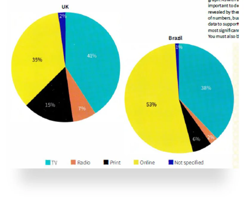
The pie charts show ways of accessing the news in the UK and Brazil.
The pie charts show four main ways (as well as a set of unlisted methods) of finding news in two countries, namely the UK and Brazil. Overall, TV and online channels are the most dominant methods in b…
Task 1
comparison
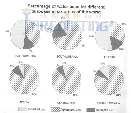
The charts below show the percentage of water used for different purposes in six areas of the world.
The pie charts show the proportional water distribution for three uses in six parts of the world. Overall, while four of the areas share broad similarities in the massive use of water for agriculture,…
